
Combine correctly – this is how wallpapers, colors and furniture appear as a harmonious whole.
Share
Combine correctly – this is how wallpapers, colors and furniture appear as a harmonious whole.
You enter a room, and everything immediately feels right. The wall color perfectly matches the decor, the wallpaper makes a statement without being overbearing, and the furniture fits seamlessly into the space.
What appears "randomly beautiful" at first glance is usually the result of a keen sense of color impact, stylistic balance, and spatial proportions . The good news: With a little basic knowledge, you too can harmoniously combine wallpaper, paint, and furniture !
The theory behind it: color wheel & contrast rules
The color wheel is a key tool in interior design. It helps you understand which colors harmonize with each other—or can be deliberately contrasted.
Tone-on-tone (analog colors)
Use colors that are next to each other on the color wheel (e.g. green & blue-green).
--> Has a calm, gentle, harmonious effect – ideal for bedrooms, retreats or elegant living spaces.
Complementary contrast
Colors that are opposite each other on the color wheel (e.g. blue & orange) create tension.
--> Appears lively, dynamic – good for creative spaces, home offices or children's rooms.
Triadic combination
Three colors that are equally far apart (e.g. red – yellow – blue).
--> Bold, creative, but balanced – works well with neutral tones as a base.
Tip: Use one dominant color (for the wall or wallpaper), one complementary color for accents (e.g. curtains, rugs) and a neutral base for furniture or large surfaces.
Wallpaper + furniture + paint – that's how it becomes a whole
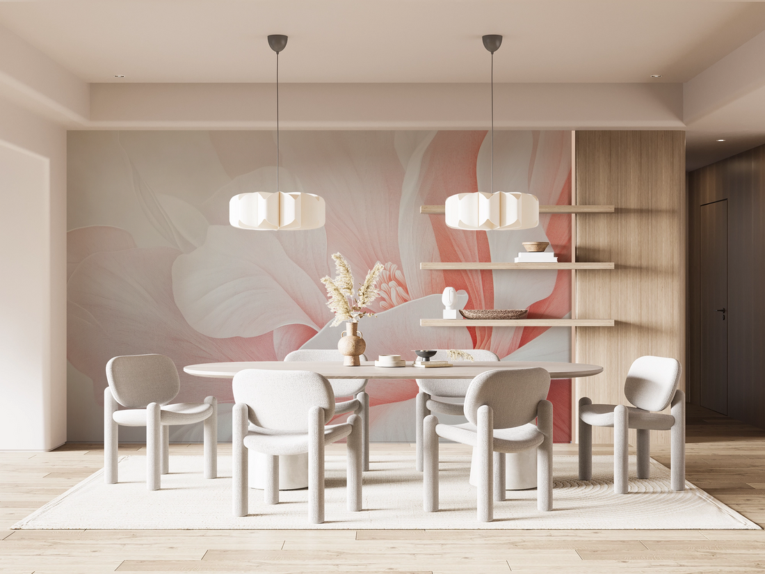
Room example 1: The cozy living room
- Wallpaper: Floral pattern in warm beige and sand tones
- Wall color: Cream white with a touch of apricot
- Furniture: Light wood tones, beige linen fabric, accents in dark green
--> The room feels warm, inviting, and calm. The colors are drawn from an analogous palette —nothing is distracting, everything flows.
Room example 2: The elegant bedroom
- Wallpaper: Velvety matte wallpaper in deep midnight blue
- Wall color: light gray or delicate dove blue
- Furniture: Golden details, dark wood, textiles in old pink
--> Here, contrasts are used in intensity – dark and light, matte and glossy. A complementary shade (antique pink) brings warmth to the cool base.
Room example 3: The creative home office
- Wallpaper: Geometric pattern in mint, ochre and white
- Wall color: Fresh white or delicate gray
- Furniture: Light oak, black metal accents, mustard yellow seat cushions
--> Fresh contrasts and structured shapes dominate here. The triad of mint, yellow, and white brings energy and focus—perfect for creative work.
Practical tips for combining
Start with an element you love —such as wallpaper or a piece of furniture—and build the color scheme around it.
Choose neutral furniture with bold wallpaper to keep the room balanced.
Repeat colors from the wallpaper in decorative elements (e.g. pillows, vases, rugs) to create a harmonious overall look.
Use materials as color tones – wood, stone, metal contribute to the color and should be included in the palette.
Conclusion: Combining is a matter of feeling – and a bit of mathematics
If you consciously coordinate wallpaper, paint and furnishings, you create rooms that not only look beautiful but also feel right .
Using the color wheel as a tool and a little sense of proportion and texture, you can create compositions that radiate calm, clarity, or liveliness —just as you wish.
Because a room is not just a place –
it is an expression of your personality.