
Tone in tone – The new harmony on the wall
Share
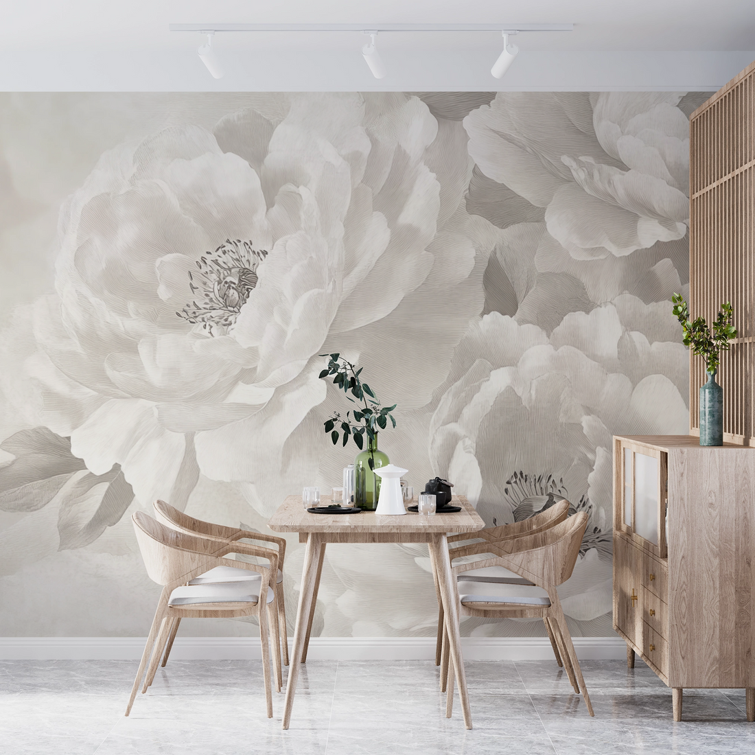
Tone on tone – the new harmony on the wall.
How wallpapers in natural and monochrome tones transform rooms and touch our senses
When we enter a home, it's not just the design that welcomes us – it's the feeling of security, clarity, or even spaciousness. Tone-on-tone wallpapers address this very issue: They create spaces that aren't loud, but rather speak – with subtle nuances, soft colors, and a harmony that directly affects our mood.
What does “tone on tone” mean?
"Tonal" describes the design with colors from the same color family—for example, different shades of beige, sand, sage, clay, or mist gray. These color concepts appear particularly harmonious because they don't create strong contrasts. The space flows visually into one another, and the walls don't protrude, but rather subtly contribute to the atmosphere.
Wallpapers in particular offer a wide variety of options: matte linen textures, delicate gradient patterns or woven textures make the room appear lively, but never obtrusive.
What effect does a tone-on-tone room have?
A room in coordinated natural tones feels like taking a deep breath. It radiates calm, warmth, and familiarity. Our eyes can relax—they don't have to process harsh transitions or bright colors. The result: We feel safer, more relaxed, more at home.
Such spaces are particularly suitable for retreat and relaxation: bedrooms, living rooms, reading rooms, or even home offices. In the bathroom, a tone-on-tone concept with sandy colors and soft lines creates an almost spa-like ambiance.
Which furniture goes with it?
The beauty of tone-on-tone concepts lies in their versatility. Depending on the combination, very different effects are created:
- With wooden furniture in light oak or walnut, the room becomes warm, natural and grounding.
- Metal or chrome accents (e.g. on lamps or side tables) bring modernity and graphic elegance.
- Linen fabrics, wool or bouclé complement the calm color world tactilely – here the look can be experienced through touch.
- Decoration in similar tones , such as clay vases, ceramics or textile art on the wall, intensifies the depth effect of the concept.
Pay attention to different textures – they create tension without breaking the color concept.
Psychology of color: Why tone-on-tone is so good
Our brain loves order – and color harmony provides just that. Rooms in harmonious tones have a calming effect on our nervous system. Studies show that people work more concentratedly, sleep better, and feel more comfortable in soft colors.
Natural tones remind us of earth, sky, and water—archetypes of security and stability. Monochromatic spaces convey a sense of clarity and control—without appearing sterile or impersonal.
Who is this style made for?
Tone-on-tone appeals to people who crave balance, calm, and stability. Those who appreciate a tidy, aesthetic environment without constantly juggling new trends will find this the ideal living style. Tone-on-tone also offers plenty of creative freedom for aesthetes who prefer to play with materials rather than color.
Conclusion:
Less contrast – more feeling.
Tonal-colored walls and wallpapers with a natural feel create spaces that slow us down and inspire us at the same time. They bring harmony to the home, creating a stylish and soothing effect. Anyone who thinks about their interior design from the wall's perspective will realize: You don't have to be loud to make an impression. Sometimes a subtle color tone is enough – and the home begins to breathe with us.